

Add Dark theme & Light theme in website
Table of content
- Introduction
- Need of dark mode on websites
- Different ways of enabling dark mode on your websites
- Additional concepts
Introduction
Enabling dark mode and light mode on a website involves creating a user interface (UI) that allows users to switch between two different color schemes: one with lighter backgrounds and darker text (light mode) and one with darker backgrounds and lighter text (dark mode). This can enhance the user experience by making the website more accessible and comfortable to view in different lighting conditions.
Each web browser has its own default CSS styles, often referred to as "user agent stylesheets". These stylesheets provide default styling for HTML elements that aren't explicitly styled by a web page's CSS. So when you create an element in HTML and don't give any styling to it, generally it used to take the default styling from the user-agent stylesheet and even these stylesheets have beautifully handled all the scenarios of light and dark mode based on the user OS theme preferences.
Need of dark mode on websites
Most people love to interact in dark mode and if you do not have this functionality in your website then there is a high chance that they would not like to interact with your website and may leave from there.
A lot of developers struggle to build the dark mode functionality in their websites due to which they use libraries or complicate their codes. In this article let's see what are the different ways using which you can build the dark mode / light mode functionality in your website without using any third-party library. In some of the ways we will only use HTML and CSS and we will also use JavaScript to build this feature using some interactions like buttons, toggles or checkboxes.
Different ways of enabling dark mode on your website.
1. Enable dark mode using color-scheme CSS property.
color-scheme is a CSS property that defines which color schemes a web page or HTML elements in a webpage can use based on the user Operating System theme selection. It affects how the user agent selects the colors for displaying various UI elements when there is no CSS defined for any particular element.
This property indicates to the browser which color scheme options should be used depending on the value provided to this CSS property.
Values we can provide to color-scheme are,
    color-scheme: normal;
    color-scheme: light;
    color-scheme: dark;
    color-scheme: light dark;
    color-scheme: only light;
The default value is normal.
Read more: https://developer.mozilla.org/en-US/docs/Web/CSS/color-scheme
Example:
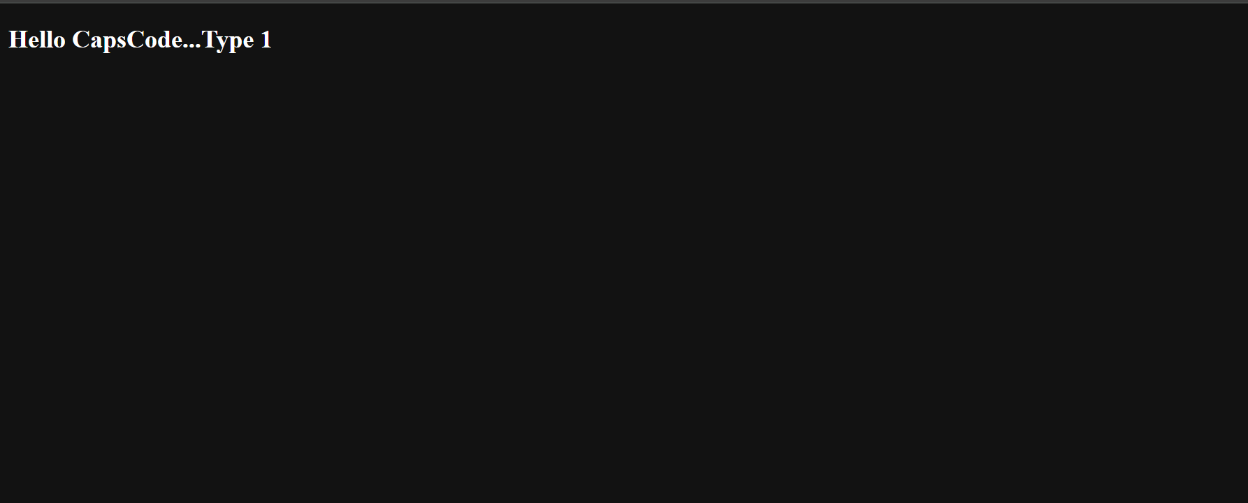
:root {
    color-scheme: dark;
    /* above code means dark theme supported */
}
Let's say we have this CSS defined in our CSS code, this indicates the browser's user-agent to use only dark theme by default without checking which theme is there in the user's Operating System.
and you will see the below output.
Now, let's see one more case,
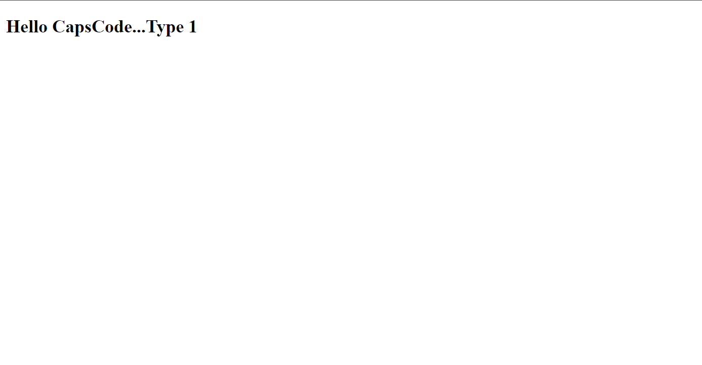
:root {
    color-scheme: dark light;
    /* above code means both dark and light theme is supported */
}
Here we have informed user-agent to use both dark and light themes, Hence browser will check the OS theme selection and based on that it will apply the color theme.
Let's see the output based on OS theme.
When the user has a dark OS theme
When the user has a light OS theme
Advantages of using color-scheme:
By declaring support for light and dark color schemes, web pages can automatically adapt to the user's preferred theme, providing a better user experience and ensuring consistency with the operating system or browser settings.
Limitations of using color-scheme:
With color-scheme we are just declaring the theme color and the control of styling we are giving to the user-agent, we don't have any control over giving our own customized style with color-scheme.
If your design requires a specific theme irrespective of the system settings (the default ones), you’ll need additional logic to override these preferences.
If you want more control over your website design then you can use media queries prefers-color-scheme and CSS variables for finer control over your theme design.
2. Enable light/dark mode using prefers-color-scheme media query.
prefers-color-scheme is a media feature or a media query property using which we can customize our CSS layouts and assign our own colors/styles to the elements based on the user's OS theme preference, unlike the previous one as with color-scheme we don't have the option of providing our own customizes CSS style based on OS theme.
When the user or system has not specified a preference, you can assume a "no preference" scenario.
The values for this can be no-preference, dark and light.
    @media (prefers-color-scheme: no-preference){}
    @media (prefers-color-scheme: dark){}
    @media (prefers-color-scheme: light){}
Read more: https://developer.mozilla.org/en-US/docs/Web/CSS/@media/prefers-color-scheme
Example: Let's see how to handle dark mode
html {
    /* the default variables */
    --background-color: #f3c2c1;
    --text-color: #000000;
}

@media (prefers-color-scheme: dark) {
    html {
        /* variable defined for dark theme */
        --background-color: #160100;
        --text-color: #ffffff
    }
}
@media (prefers-color-scheme: light) {
    html {
        /* variable defined for light theme */
        --background-color: #ffffff;
        --text-color: #000000;
    }
}

@media (prefers-color-scheme: no-preference) {
    html {
        /* variable defined when user has no-preference */
        --background-color: #1c0ae0;
        --text-color: #02ff6c;
    }
}
Here if you see, we have defined the background-color variable and text-colorCSS variable so by default when the user doesn't have any theme preference then the color #f3c2c1 for --background-color and #000000 for --text-color will be applied and if the user's OS has any of the themes selected then based on that theme the colors will be applied.
CSS Variables: https://www.capscode.in/blog/variable-in-css
If the user has selected a light theme:
If the user has selected a dark theme:

some corner cases,
If the user has a dark OS theme and @media (prefers-color-scheme: dark) is not defined, then whatever CSS you have written in the .html{} will be the default one.
Similarly for the light theme as well.
Example
html {
    --background-color: #f3c2c1;
    --text-color: #000000;
}

@media (prefers-color-scheme: light) {
    html {
        --background-color: #ffffff;
        --text-color: #000000;
    }
}
Based on the above code, when the OS theme is light then @media (prefers-color-scheme: light){} will be used but if the user's OS has a dark theme then the code written in html{} will be considered as we haven't defined @media (prefers-color-scheme: dark){} in our CSS code.
Let's see the output below.
If the user has a light OS theme:
If the user has a dark OS theme:

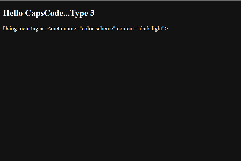
3. Enable light/dark mode using <meta name="color-scheme" content="dark light">
The next way of enabling light/dark mode is using a meta tag. This looks similar to the first implementation isn't it, But in the first implementation we were doing it using CSS and in this approach, we are using HTML document (meta tag). Hence we have more control over the HTML element and changing the attributes of the HTML elements. In this section, we will see the default behavior of adding color-scheme meta tag and then we will see how changing attributes will help in creating light-themed & dark-themed web apps using JavaScript in further topics.
Example:
<!DOCTYPE html> <html lang="en"> <head> <meta charset="UTF-8"> <meta name="viewport" content="width=device-width, initial-scale=1.0"> <meta name="color-scheme" content="dark light"> <link rel="stylesheet" href="index.css"> <title>Document</title> </head> <body> <section> <h1>Hello CapsCode...Type 3</h1> <p>Using meta tag as: <meta name="color-scheme" content="dark light"> </p> </section> </body> </html>
Here if you see we have added a meta tag named color-scheme and assigned a content value of dark light in the header of the document. This indicates that our document supports both dark and light themes based on the user's OS theme selection and the rest of the functionality is similar to the first approach discussed above.
If the user has a light OS theme.
If the user has a dark OS theme.
As of now, we have seen the different ways of enabling light mode & dark mode on the website but all of those steps are static based on the user's operating system theme selection where the user doesn't have control over switching between the themes.
Now let us see how we can add JavaScript in our code to have some interactivity and will switch between the themes in our web apps.
4. Enable dark mode by setting color-scheme value in the meta tag using JS
In this section, we will see how we can change color-scheme content value to dark/light when clicking on the button.
Example
<!DOCTYPE html>
<html lang="en">

<head>
    <meta charset="UTF-8">
    <meta name="viewport" content="width=device-width, initial-scale=1.0">
    <meta name="color-scheme" id="colorScheme" content="">
    <title>Document</title>
    <script>
        function setColorScheme(scheme) {
            var colorSchemeMeta = document.getElementById('colorScheme');
            colorSchemeMeta.setAttribute('content', scheme);
        }
    </script>
</head>

<body>
    <section>
        <h1>Hello CapsCode...Type 4</h1>
        <button onclick="setColorScheme('dark')">Enable dark mode</button>
        <button onclick="setColorScheme('light')">Enable light mode</button>
    </section>
</body>

</html>
Below is the output:
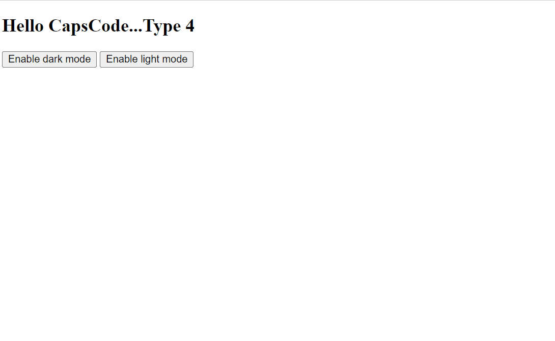
In this example, we have two buttons, one for light mode and another for dark mode, clicking on which will call the setColorScheme function and that function will add the light or dark values in the color-scheme meta tag and based on that we can see the styles in the UI.
Advantages of this method:
We can have a toggle to switch between the light and the dark mode and it's not only depend upon the OS theme.
Limitations of this method:
We cannot add our customized colors/styles for the theme selected, the colors and other styling stuff will be handled by the user-agent and we don't have much control over the UX (mostly colors).
So, The next question is how we can have both, a toggle between the themes and the control over the declaration of our custom CSS.
Well, there are multiple ways but in this article, we will see the two most easy and helpful approaches.
5. Enable dark mode by setting an attribute in the body or html tag
We can add some attribute in the html or body tag and based on the value of that attribute we can declare our CSS so that our UI will reflect the CSS based on the attribute value.
Example:
<!DOCTYPE html>
<html lang="en">

<head>
    <meta charset="UTF-8">
    <meta name="viewport" content="width=device-width, initial-scale=1.0">
    <link rel="stylesheet" href="index.css">
    <title>Document</title>
    <script>
        function darkmode() {
            document.body.setAttribute('dark-theme', true);
        }
        function lightmode() {
            document.body.setAttribute('dark-theme', false);
        }
    </script>
</head>

<body>
    <section>
        <button id="dark" onclick="darkmode()">Enable dark mode</button>
        <button id="light" onclick="lightmode()">Enable light mode</button>
        <h1>Hello CapsCode...Type 5</h1>
        <p>Using JS and toggle buttons</p>
    </section>
</body>

</html>
So, here in the above code, you can see that we have two buttons, one for light mode and other for dark mode, clicking on one will call their respective functions which will add the dark-theme attribute in the body and give it a boolean value of true or false depending on the function called.
Let's see how our CSS is defined.
body[dark-theme=false] {
    --background-color: #f3c2c1;
    --text-color: #000000;
}

body[dark-theme=true] {
    --background-color: #160100;
    --text-color: #ffffff
}

body {
    min-height: 100vh;
    background: var(--background-color);
}

h1,p {
    color: var(--text-color)
}
Based on the defined CSS, we can see the below output.
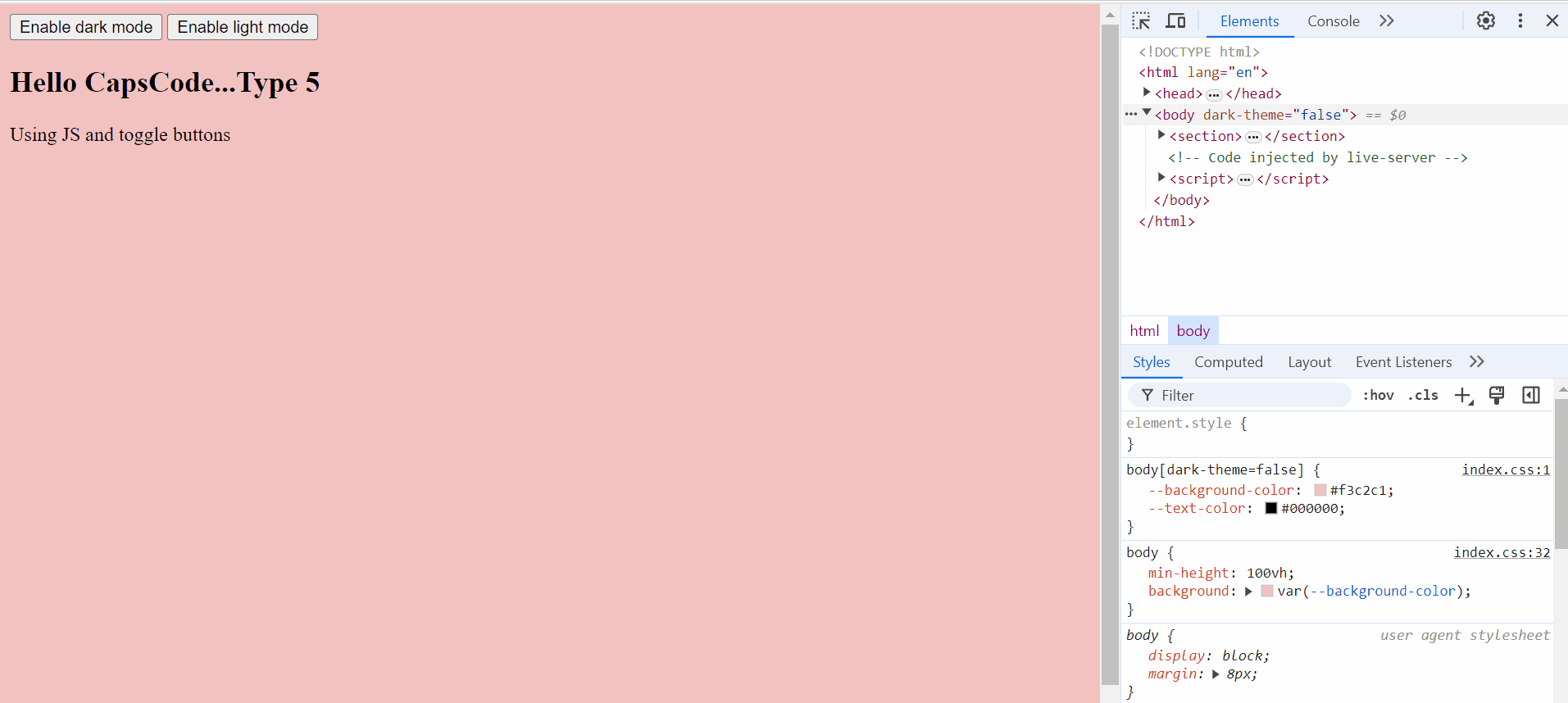
you can see in the dev tool, how clicking on the buttons adds/changes the values in the data-theme attribute of the body tag.
When we click on the Enable dark mode button, dark-theme="true" attribute is added in the body tag and from our CSS file, the below CSS will be taken into consideration.
body[dark-theme=true] {
    --background-color: #160100;
    --text-color: #ffffff
}
Due to the above CSS background-color of the body becomes darker and the text-color becomes lighter.
When we click on the Enable light mode button, dark-theme="false" attribute is added in the body tag and from our CSS file, the below CSS will be taken into consideration.
body[dark-theme=false] {
    --background-color: #f3c2c1;
    --text-color: #000000;
}
Due to the above CSS background-color of the body becomes lighter and the text-color becomes darker.
NOTE: Instead of adding the attribute in the body tag we can add the attribute in the html tag as well and there is no restriction in providing the attribute names.
6. Enable dark mode by setting the class name in the body or html tag
In this example, we will see how we can enable dark mode in our application by adding class names in the body tag dynamically by clicking on a toggle button.
Example:
Here is our HTML code
<!DOCTYPE html>
<html lang="en">

<head>
    <meta charset="UTF-8">
    <meta name="viewport" content="width=device-width, initial-scale=1.0">
    <link rel="stylesheet" href="index.css">
    <title>Document</title>
    <script>
        function themeHandler() {
            const themeToggleButton = document.getElementById('toggle');
            let currentTheme = document.body.classList[0]

            if (currentTheme == undefined) {
                document.body.classList.add(`dark-mode`);
            }
            if (currentTheme == "dark-mode") {
                document.body.classList.remove('dark-mode');
                document.body.classList.add(`light-mode`);
            }
            else {
                document.body.classList.remove('light-mode');
                document.body.classList.add(`dark-mode`);
            }
        }
    </script>
</head>

<body>
    <section>
        <button id="toggle" onclick="themeHandler()">Toggle Theme</button>
        <h1>Hello CapsCode...Type 7</h1>
        <p>Using JS and toggle buttons</p>
    </section>

</body>

</html>
In the above code, you can see that we are adding a class name dynamically in the body tag (i.e. dark-mode or light-mode).
Our themeHandler function first checks what is the current class name in the body tag and if there is no class name given to the body tag then we give the class name as dark-theme. We have written a condition that if the current theme is dark-mode and when you click on the toggle button it will add light-mode and vice versa.
Below is our CSS code.
  /* Default (light mode) styles */
 body.light-mode {
     --background-color: #f3c2c1;
     --text-color: #000000;
 }

 /* Dark mode styles */
 body.dark-mode {
     --background-color: #160100;
     --text-color: #ffffff
 }

 body {
     height: 100vh;
     background-color: var(--background-color);
 }

 h1, p {
     color: var(--text-color);
 }
Below is the output.
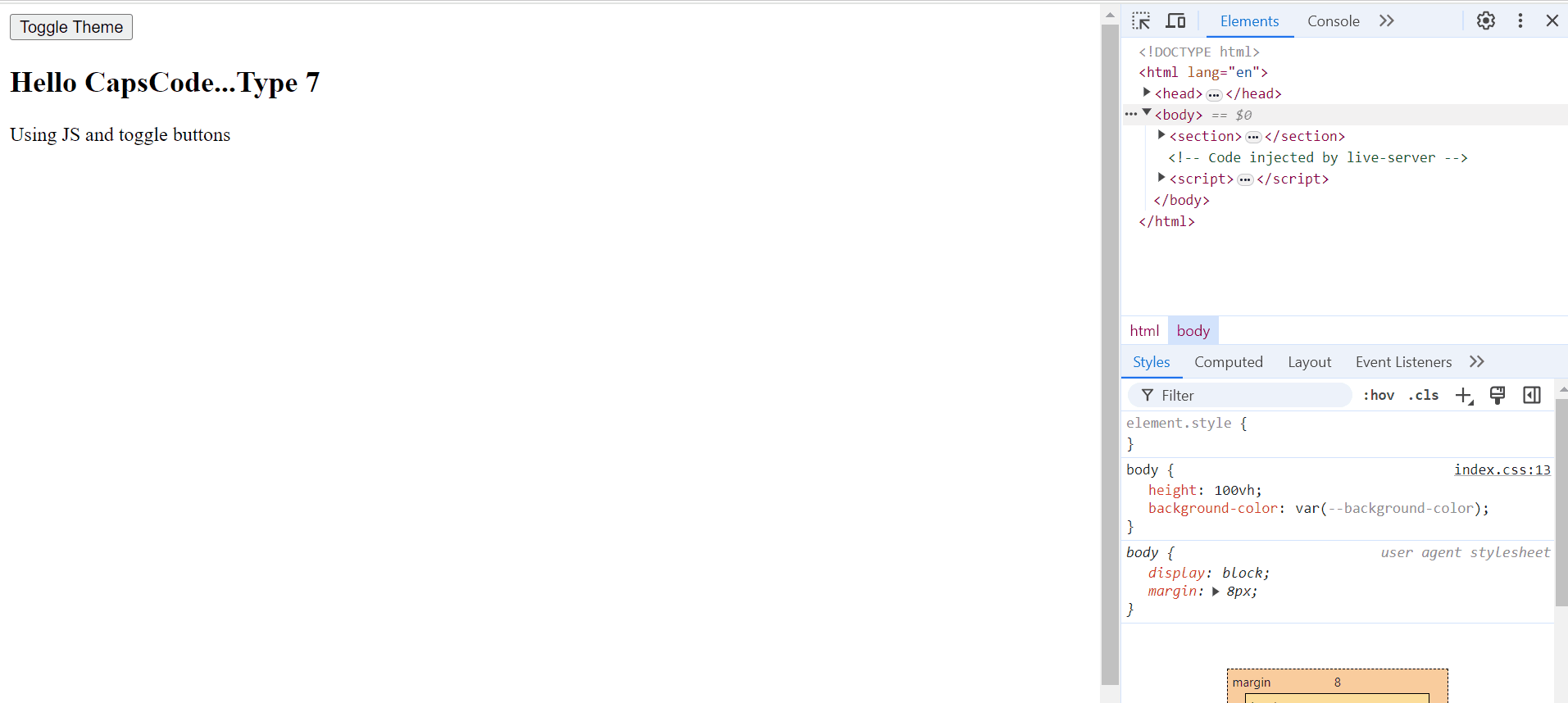
You can see in the dev tool, how clicking on the toggle buttons adds the class name in the body tag.
When dark-mode class name is added then the below CSS will be taken into consideration.
body.dark-mode {
     --background-color: #160100;
     --text-color: #ffffff
}
Due to the above CSS, the background-color of the body becomes darker and the text-color becomes lighter.
When light-mode class name is added in the body tag then the below CSS will be taken into consideration.
 body.light-mode {
     --background-color: #f3c2c1;
     --text-color: #000000;
 }
Due to this, the background-color of the body becomes lighter and the text-color becomes darker.
Additional concept
We have seen how we can play around the theme using JavaScript by adding our custom class name or attributes and assigning CSS based on this.
So let's design something different using this concept.
Use case: Click on the button to zoom-in and zoom-out contents on the website.
Example:
Below is the html code.
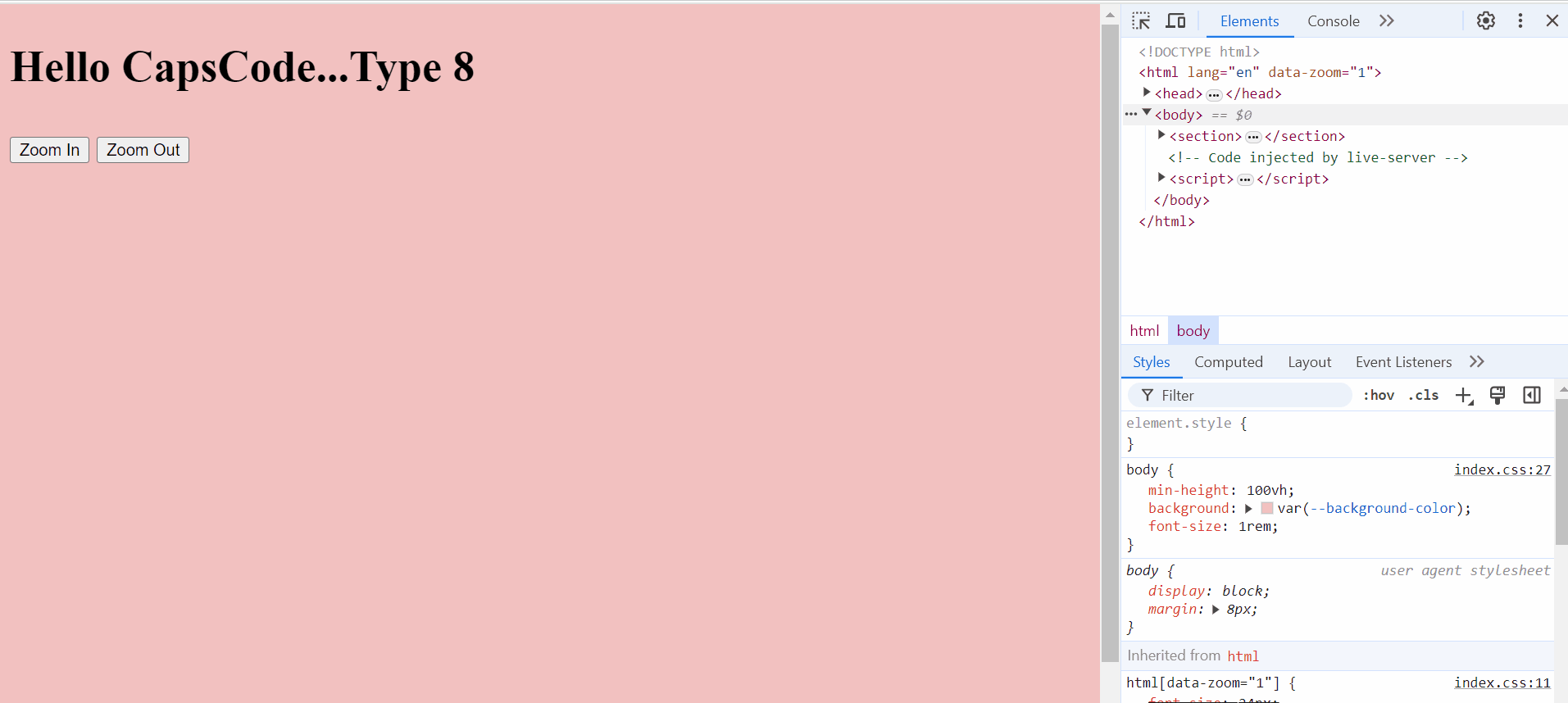
<!DOCTYPE html>
<html lang="en">

<head>
    <meta charset="UTF-8">
    <meta name="viewport" content="width=device-width, initial-scale=1.0">
    <link rel="stylesheet" href="index.css">
    <title>Document</title>

    <script>
        function zoomIn() {
            document.documentElement.setAttribute('data-zoom', "2")
        }
        function zoomOut() {
            document.documentElement.setAttribute('data-zoom', "1")
        }
    </script>
</head>

<body>
    <section>
        <h1>Hello CapsCode...Type 8</h1>
        <button onclick="zoomIn()">Zoom In</button>
        <button onclick="zoomOut()">Zoom Out</button>
    </section>
</body>

</html>
Here we have one Zoom In button and one Zoom Out button, clicking on which will add the attribute data-zoom=2 and data-zoom=1 respectively in the html tag.
Based on this we have below CSS written in our CSS file.
html {
    --background-color: #f3c2c1;
    --text-color: #000000;
    font-size: 24px
}
html[data-zoom="1"] {
    font-size: 24px
}
html[data-zoom="2"] {
    font-size: 44px
}
body {
    min-height: 100vh;
    background: var(--background-color);
    font-size: 1rem;
}
h1, p {
    color: var(--text-color)
}
In this example, we are changing the font-size of the root element based on the attribute of HTML tag.
If you want to learn more about how rem font unit works then do check out the link below.
https://www.youtube.com/watch?v=0GjVwGvvNtk
Below is the Output:
Conclusion
These are the multiple ways to add dark mode or light mode to your website, enhancing the user experience by allowing users to view content in their preferred mode. By leveraging CSS media queries, JavaScript, and browser or system theme preferences, you can provide a seamless and personalized browsing experience. Whether you choose to rely on system settings, offer a manual toggle, or a combination of both, implementing theme toggle mode ensures your website is accessible and visually appealing to a wider audience.
Hope it's a nice and informative read for you. If you find this article useful, like and share this article. Someone could find it useful too.